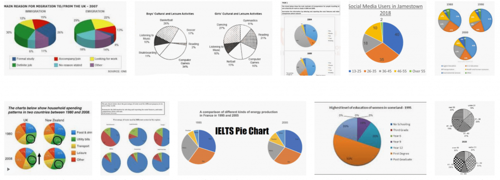
الرسوم الدائرية او الباي شارت يعتبر من اسهل انواع الرسوم في تاسك ١.. دائما يجي هذا النوع من الرسوم بالنسب،
راح يجيب لك مجموعتين او اربع مجموعات وممكن اكثر وتقارن بينهم.. وهذي بعض الأمثلة على شكل سؤال الرسوم الدائرية

اتفقنا راح نستخدم القالب “اهم تكنيكة في الكتابة” لحل هذا النوع من الرسوم..

ودحين خليني اوريك مثالين من مشاركتكم تم حلهم باستخدام القالب 🤸🏻♀️
المثال 1️⃣

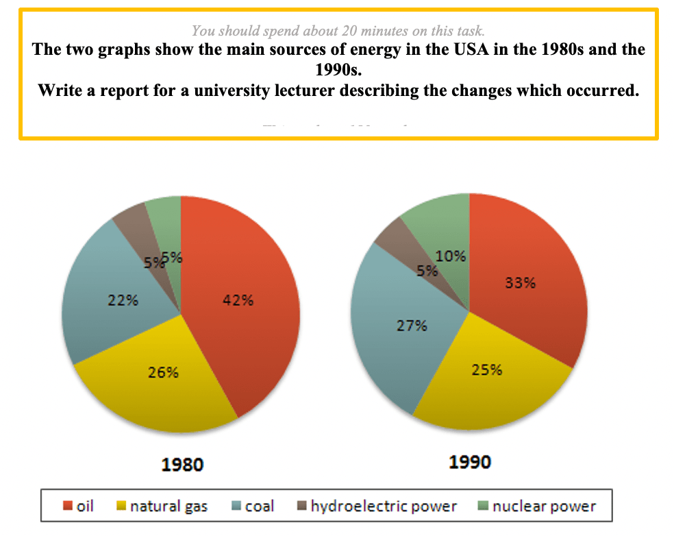
These pie charts depict the most important energy sources between 1980 and 1990 in United State. It is clear from the graph that more than 80 percent of the energy in the USA produced from oil, natural gas and coal.
According to what is shown, oil accounted for the highest contribution in energy sectors in both 1980 and 1990, despite the fact that oil consumption reduced by 9% by 1990. On the other hand coal had grown from 22% to 27% between 1980 to 1990, while natural gas presented a tiny growth in the same period.
As for the other sources, the nuclear and hydroelectric power presented a contrary behavior. The nuclear energy contribution grew by the double between 1980 and 1990, while the other sustained at about the same level during the same period.
To sum up, we could say that the contribution of nuclear and hydroelectric energy ‘ as an aggregate’ grew by 5%, while the it reduced from 90% to 85% for the other three sources.
إذا حاب تشوف التصحيح كامل مع تعليق المصحح على الاخطاء اضغط هنا
المثال 2️⃣

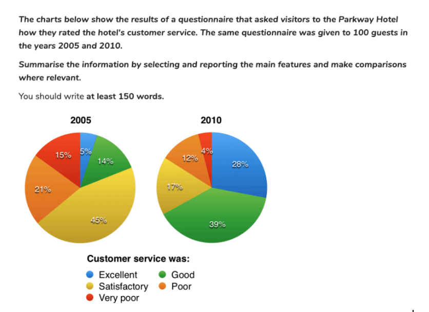
The pie charts give information about the Parkway Hotel`s visitors satisfaction about hotel`s customer service in two different years. 100 guests were given the exact survey in 2005 and 2010. It is clear from the graphs there was a significant difference in percentages between the two years.
According to what is shown, in 2005, the majority of guests were satisfied in 45%. And 14% of guests rated the hotel`s customer service as good and only 5% rated excellent. Despite that, visitors who felt very poor and poor about the service were 15% and 21% respectively.
Taking a closer look at the second graph, in 2010, the percentage of satisfactory decreased sharply until reached 17%. But guests who felt good increased significantly until reached 39%. Also, excellent rate climbed from 5%to 28%. So, as a result, feeling very poor and poor were only 4% and 12% respectively.
To sum up, we could say that visitors who felt unsatisfaction decreased over years but who felt good increased.
إذا حاب تشوف التصحيح كامل مع تعليق المصحح على الاخطاء اضغط هنا
إذا استفدت شارك هذا المقال 💛
وإذا عندك اي سؤال ارسلي في تويتر من هنا


0 Comments