رسوم الأعمدة او البار شارت من أنواع الرسوم الشائعة في تاسك ١ زي اللاين شارت.. الفرق بينهم انه اللاين شارت يجي على أساس السنوات أما البار شارت على أساس الأصناف والأنواع..
وهذي بعض الأمثلة على شكل سؤال رسوم الاعمدة

اتفقنا راح نستخدم القالب “اهم تكنيكة في الكتابة” لحل هذا النوع من الرسوم..

ودحين خليني اوريك مثالين من مشاركتكم تم حلهم باستخدام القالب 🤸🏻♀️
المثال 1️⃣

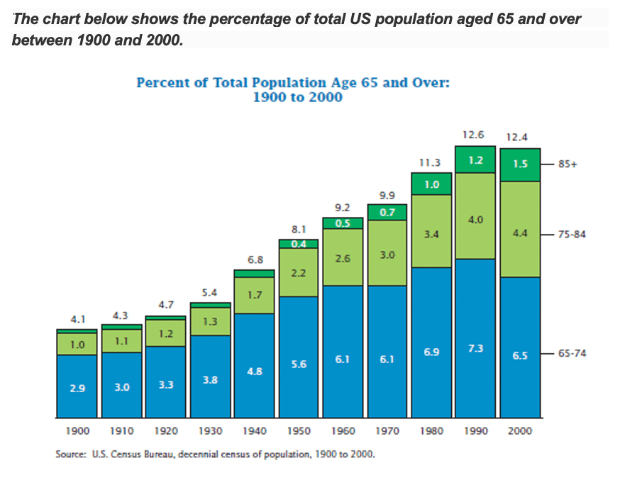
The bar chart depicts the proportion of total the United States nation who are 65 years old and above in the period from 1900 to 2000. It is clear from the chart that the percentage had increased all over the years.
According to what is shown, the figure of the US population aged 65-74 had raised steadily from 2.9% in 1900 to 5.6% in 1950. In the following two decades, the percentages had stabled on 6.1%, after that, the rate of the population had continued increasing to reached the peak at 7.3% before the noticeable drop in 2000 (6.5%)
In addition, the percentage of age groups 75-84 and over 85 had climbed steadily until reached 4.4% and 1.5% respectively in 2000.
To sum up, for the total population groups over 65 years old, the number had increased constantly in the first four decades. Next, before the small drop in 2000 (12.4%), US witnesses a sharply raised in the percentage between 1940 and 1990.
إذا حاب تشوف التصحيح كامل مع تعليق المصحح على الاخطاء اضغط هنا
المثال 2️⃣
The bar chart below depicts the females average number for every 100 males, who are pursuing in different educational levels in developing countries compared to developed countries in two periods. It is clear from the graph that, the girls’ number increased from 1990 to 1998 across all levels of education.
According to what is shown, the girls’ proportion in the primary and secondary schools had increased slightly during the interval in developing nations in contrast to developed nations, which remained almost the same. But developed countries were the nearest to the target.
On the other hand, tertiary education numbers were much lower than the essential education. The percentage in developing countries increased by about a tenth from 60 to 75 during the period, while in developed countries the number overachieved the main target. Reaching 105 and 112 in 1990 and 1998 respectively.
To sum up, we could say that the female figure in developed nations was much more than developing nations, especially in tertiary education.
إذا حاب تشوف التصحيح كامل مع تعليق المصحح على الاخطاء اضغط هنا
إذا استفدت شارك هذا المقال 💛
وإذا عندك اي سؤال ارسلي في تويتر من هنا


0 Comments